With our range of flexible finance solutions to suit all budgets.
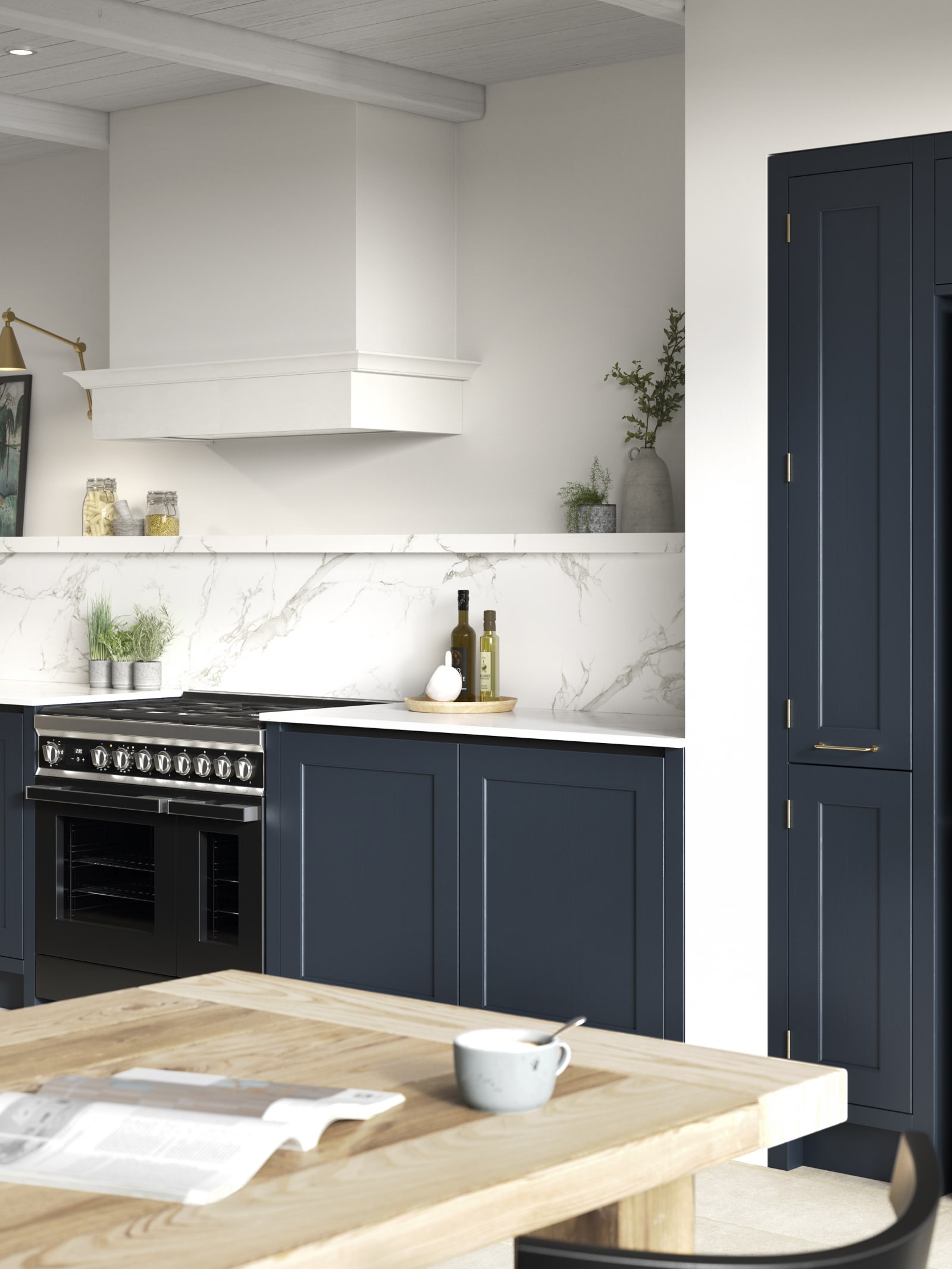
A vibrant kitchen is a joy to behold and use. Check out these colourful kitchen design ideas to add a splash of joy to your kitchen.
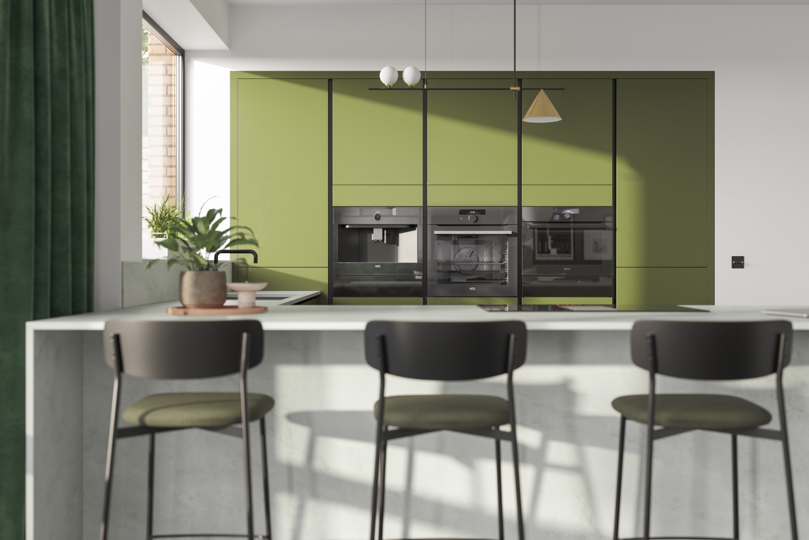
Designing a colourful kitchen is a great way to brighten up your home.
The right colours can also lift your mood, set the ambience, and bring your space up-to-date with the latest trends.
Colour is a crucial interior design feature, and can give your home a quick and easy transformation. But some colours pair better than others, and the colour wheel is a great tool for helping you choose the right combinations.
Read on to find out everything you need to know about interior colour palettes, as well as colour ideas for kitchen walls, countertops and cabinets.
Having a considered approach to your home’s colour scheme matters.
For communal spaces such as the kitchen, colours can help you create the perfect atmosphere, whether you want it to be light, bright and airy or cosy and inviting. Perhaps you want your kitchen to feel rustic and organic, or maybe you want a clean, contemporary look.
Whatever you're trying to achieve, it all starts with having balance (knowing what colour goes well together). This is where colour theory comes in.
By using the colour wheel as a guide, you can design a colourful kitchen that your family will love.
There are three main colour scheme styles, and each of these can bring colour harmonisation to your kitchen:
If you want simple, elegant or minimalist colour ideas for kitchen walls and cabinets, a tonal or monochromatic colour scheme could be perfect for your home.
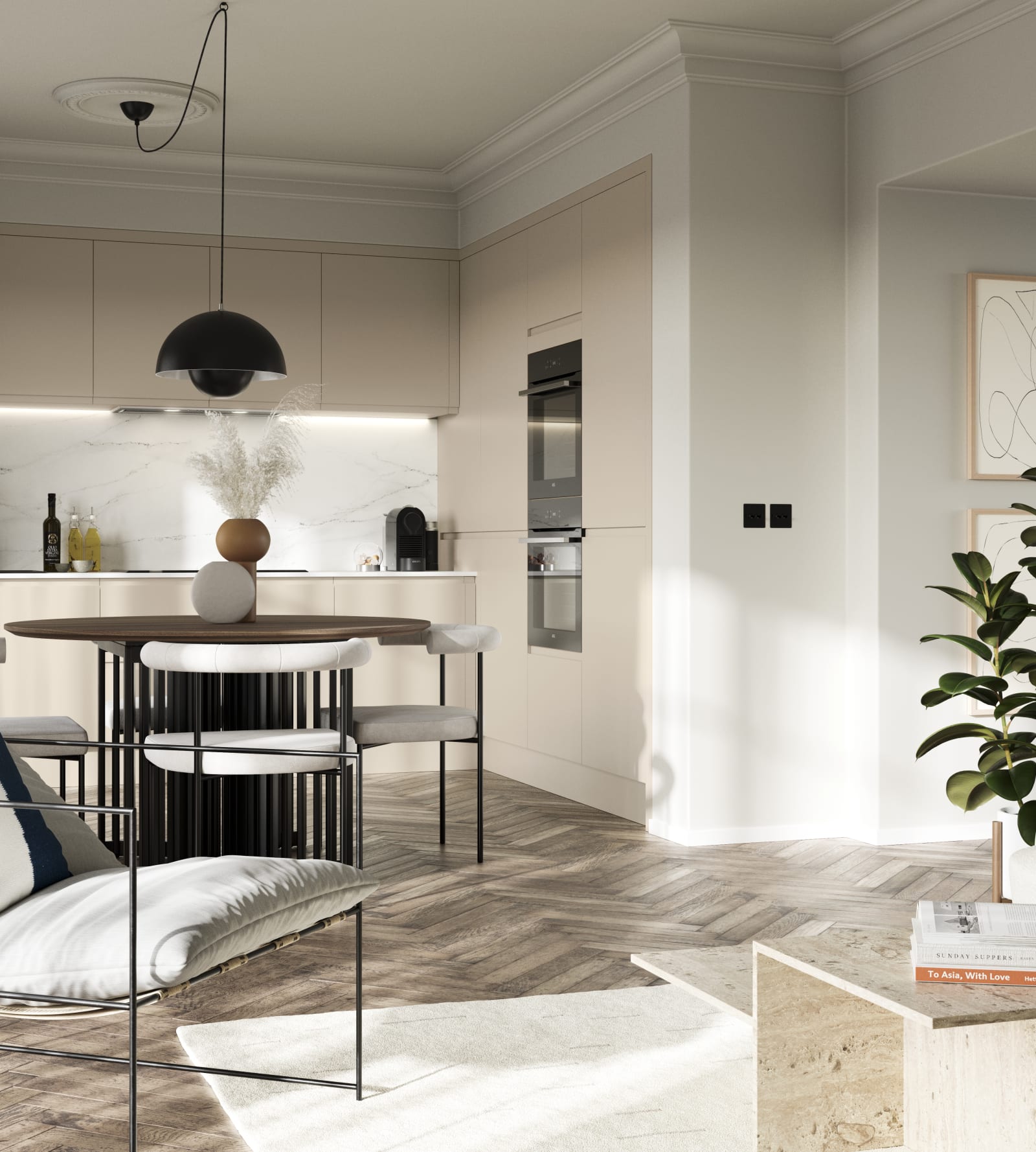
Tonal colour schemes optimise one main colour or very similar colours - but in varying tones.
For instance, you could go for earthy interior design, mixing natural browns, deep sand, and rich terracotta. Alternatively, you could stick with one leading hue - let’s say blue - and experiment with shade variations like navy blue, midnight blue, and teal blue.
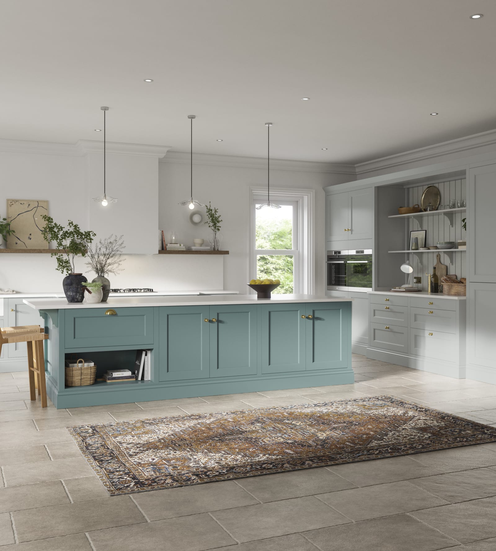
Harmonious colours are the colours that are next to each other on the wheel and they are extremely easy on the eye.
If your goal is to design an inviting communal space where the family can cook, eat and relax, harmonious colour schemes are going to become your best friend.
Also known as an analogous colour scheme, it typically combines three to five adjacent colours that create an ombre effect. Both comfortable to look at and easy on the eye, this colour scheme is ideal for minimalist homes.
Working differently to harmonious colours, the complementary colour scheme takes two colours that are on the opposite side of the colour wheel.
This colour combination is contrasting, which can add interest and intrigue to your kitchen design.
As they say, opposites attract - and with complementary colours, it’s no different. These hues will look great together, and can also be a great way to inject life into your home without colour clashing.
This colour scheme works well in traditional and contemporary kitchens, but can look especially attractive for retro kitchen designs.

In addition to using colour theory to help you design your dream space, it’s also important to understand the meanings of different colours. Did you know that colour psychology plays a major role in how interior colours make us feel?
Not only are colours symbolic, but they have the ability to change our mood. Studies actually show that natural colours like green create a significant reduction in heart rate, reducing stress and helping us relax.
Similarly, gentle pinks can calm the senses while inducing feelings of comfort. Colours like yellow and orange can make you happy, while also boosting creativity.
Then there are the associations that we have formed with certain colours. Have you noticed that black is always used for luxury brands and is, therefore, a symbol of quality and sophistication? Or that white is linked to purity and cleanliness, making it suitable for a minimalist kitchen?
So as well as thinking about the psychology of colours and how different hues impact your mood, consider what colours represent and what they could say about you.
Here’s a quick look at some colours, what they mean, and how they make you feel:
|
Interior colour |
Association |
Mood |
|
Red |
Energy, strength, passion, power and low |
Lively, excited and stimulated |
|
Green |
Nature, life, growth and balance |
Relaxed, calm and happy |
|
Blue |
Peace, serenity, stability and intelligence |
Calm and productive |
|
Orange |
Warmth, optimism and sociability |
Happy, creative and confident |
|
Yellow |
Richness, warmth, joy and positivity |
Happy, energetic and spontaneous |
|
Purple |
Luxury, wealth, fun and royalty |
Happy, playful, creative and productive |
|
Black |
Power, mystery, luxury and sophistication |
Strong, seductive and serious |
|
White |
Balance, innocence, purity, freshness and cleanliness |
Peaceful, calm and organised |
This is by no means an exhaustive list and it’s important to remember that different colours will mean different things to different people. Colours can represent a variation of things in different cultures too, so choosing the right colour scheme for your kitchen can involve a lot of variation of factors.
If a colour looks beautiful in your kitchen design and it makes you feel good, it’s a great choice. Your kitchen is the heart of the home, so go for the colours that you enjoy the most and follow your gut as much as possible, relying on colour theory and psychology.

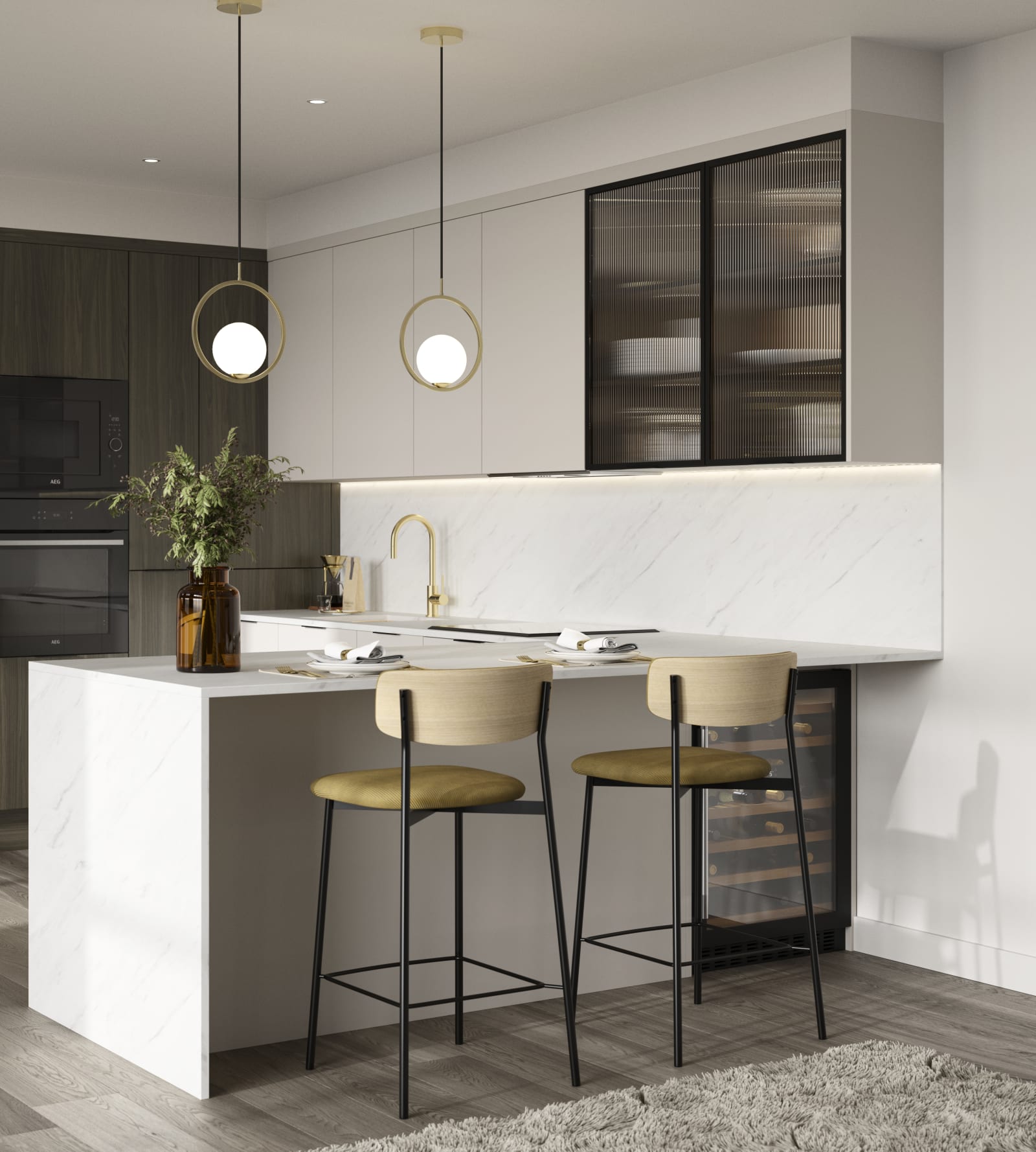
Looking for the best colour ideas for kitchen walls, countertops and cabinets? There are so many exciting kitchen colour schemes to explore at Magnet.
Here are some that could inspire your next kitchen makeover:
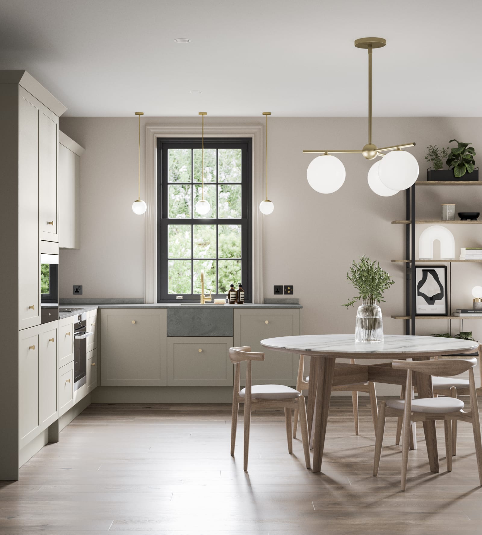
As one of the most popular kitchen colours, grey is a staple in kitchen design. It’s also a brilliant starting point if you’re not sure what colours you want to incorporate. Plus, if you’re wondering what colour goes with grey kitchen units, you’ll be pleased to know that most colours in the colour wheel pair well with grey.
This is because grey is an all-time favourite neutral, one that offers incredible versatility in the home. The key to achieving the perfect match for your grey kitchen is to coordinate the tones. For instance, there are soft greys and darker, more mysterious greys, cool vs. warm greys, and well-known variations such as ‘greige’ (grey + beige) or many blue-toned coastal greys.
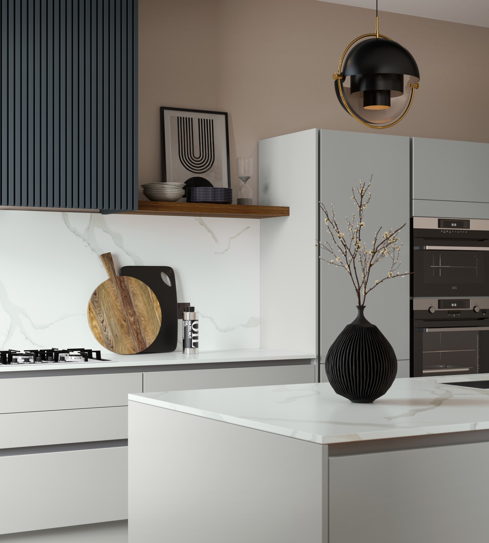

Deep, dark blues have grown in popularity in recent years, with this kitchen colour trend now establishing itself as a mainstay. A navy kitchen can be incredibly modern, bringing an otherwise outdated space up-to-date. At the same time, navy oozes confidence, sophistication and power, giving your home a lavish and grown-up twist.
In terms of colour combinations, gold and brass are the perfect finishing touches to bring your navy colour scheme to life. You can also elevate your navy kitchen with slate grey or black worktops, which will add a touch of urban elegance. Or you can mix navy and white for something fresh and inviting.
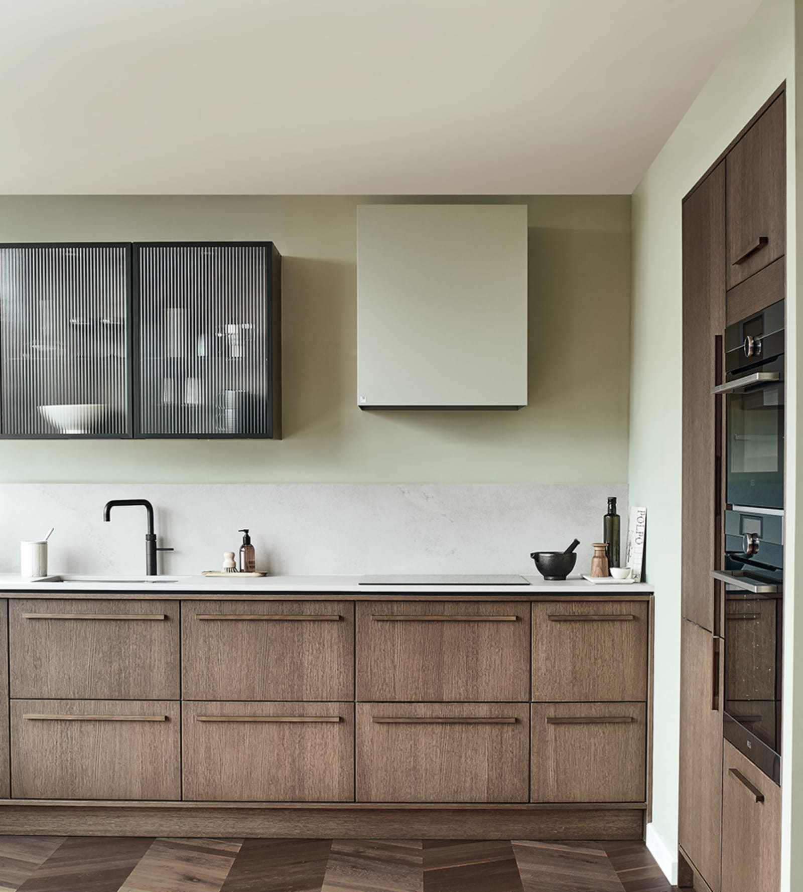
Sage green is a versatile colour choice because it’s easy on the eye and promotes relaxation. While it is much loved for traditional interiors, there are many ways to incorporate this colour into a modern design concept.
So what colours go with sage green kitchen units? Think soothing neutrals like soft creams, pebble greys, white marble, or even earth tones for an organic finish. You can also experiment with monochromatic colour schemes and keep things tonal with a variety of greens.
Herbaceous hues are fantastic for adding elements of nature into your home. They can work particularly well in a country-style kitchen, an indoor-outdoor kitchen that backs out into the garden, or even a minimalist kitchen that is in need of a splash of colour.
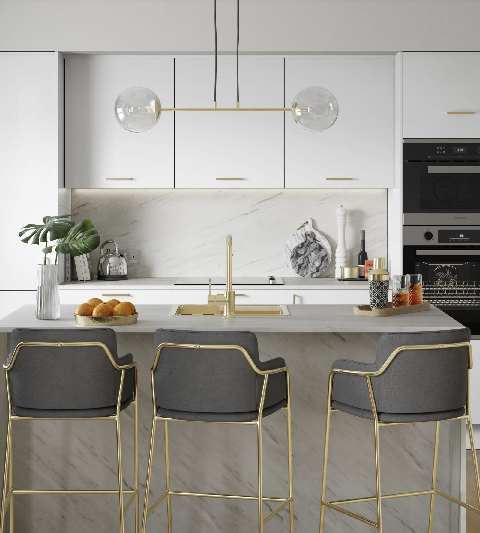
The colour white in interior design reflects light and makes rooms appear larger. If you have a dark, dingy kitchen that feels cramped, make the white colour palette your go-to.
Like grey, white can be matched with every colour on the colour wheel, giving you endless opportunities to personalise. Paired with black, you will have the perfect recipe for Scandinavian or Japanese minimalism. Or styled with tonal greys, you can add depth and dimension to your space while still keeping it clean, fuss-free and simple.
Match white with rich creams or blush shades for instant warmth, team with blues for a nautical touch, or combine with wooden worktops for rustic country-style elegance.
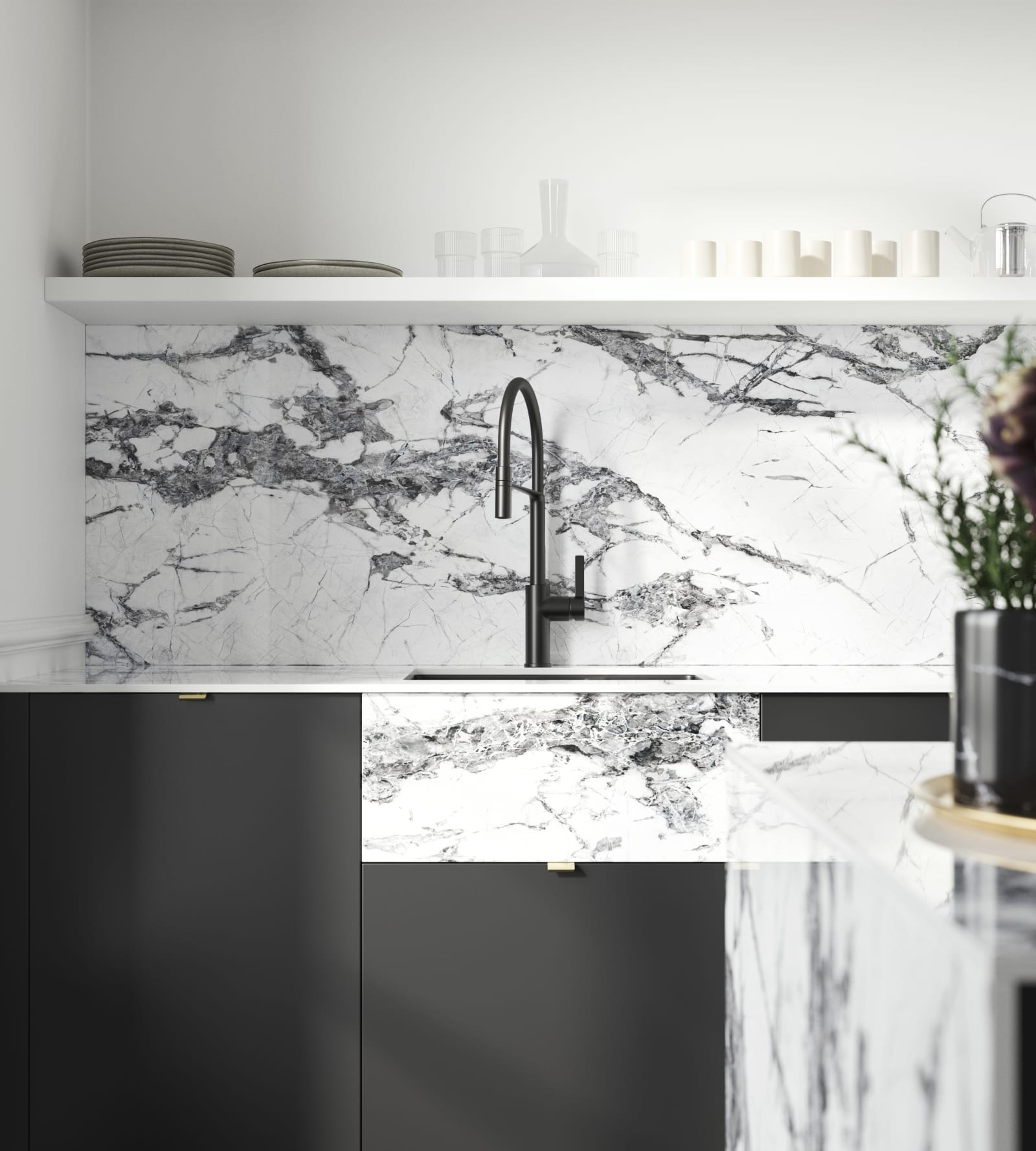
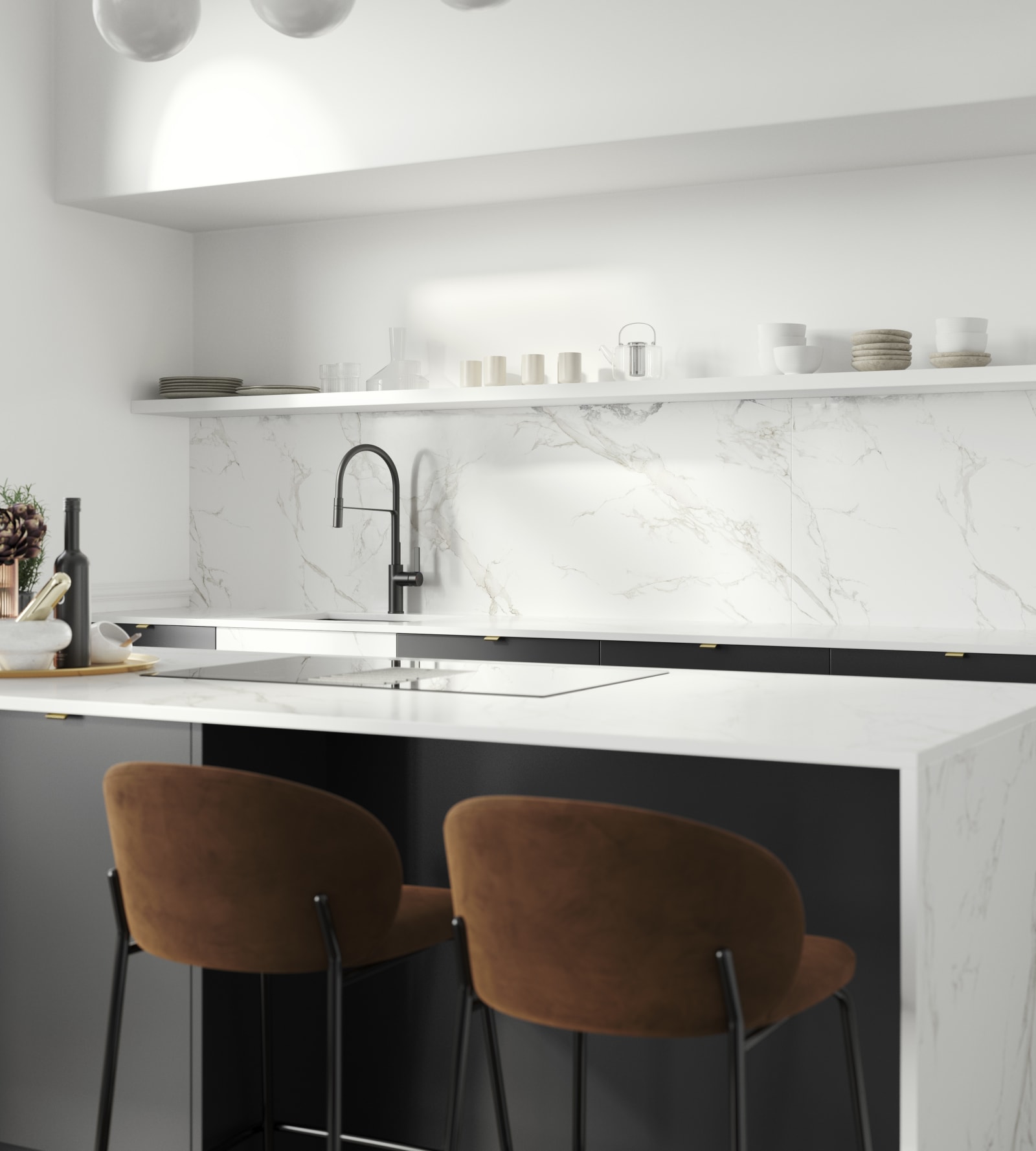
There’s something so stylish about a black kitchen. Despite what you may think, black doesn’t always mean making your home feel dark. When matched with the right colours, it can actually help to build contrast, draw attention to/from the right features, and create shadows and light through clever placement.
Black and white kitchens can be uber-contemporary, while black and red can scream urban retro, and a black and brick kitchen can give your home that upmarket New York apartment vibe.
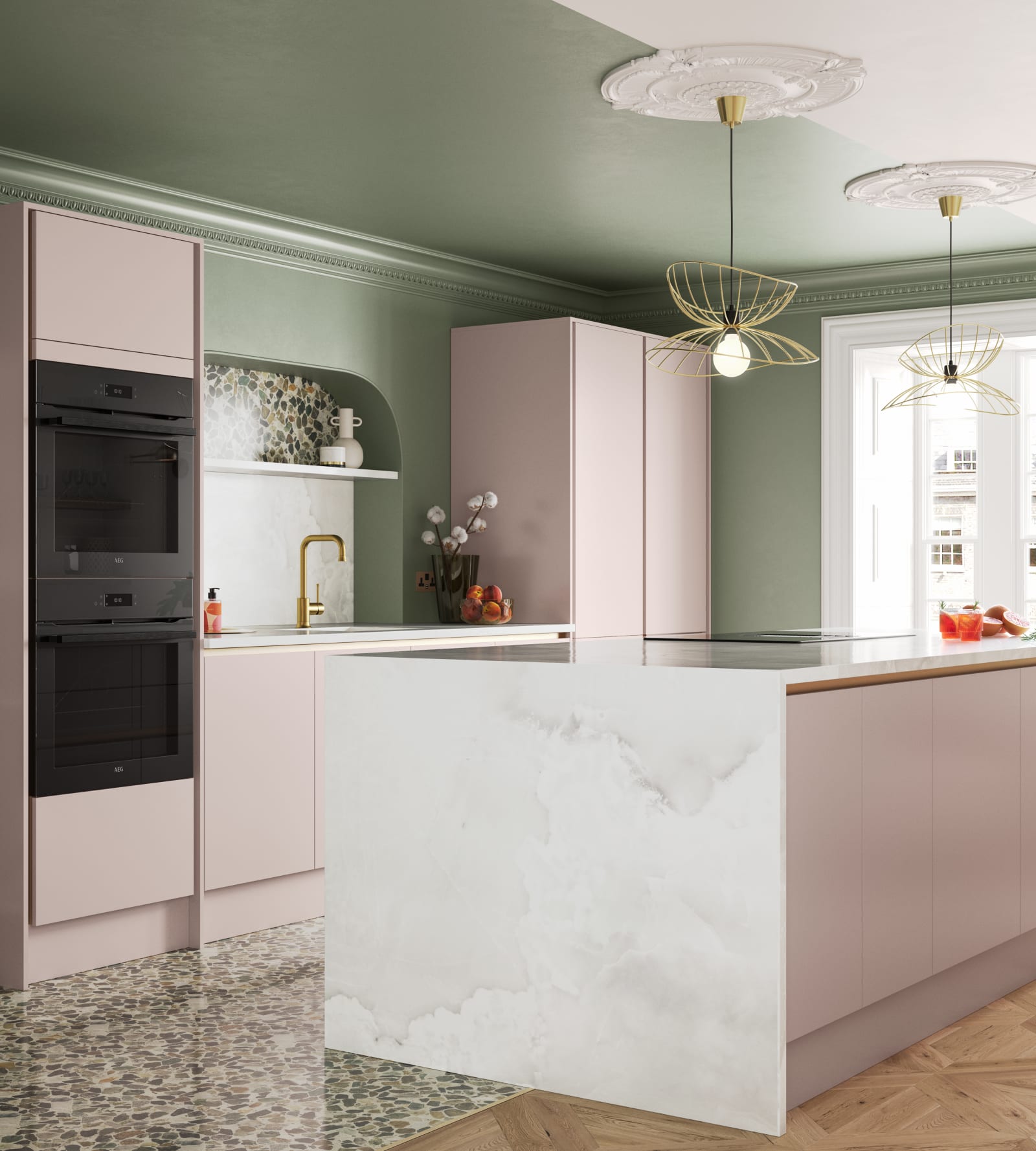
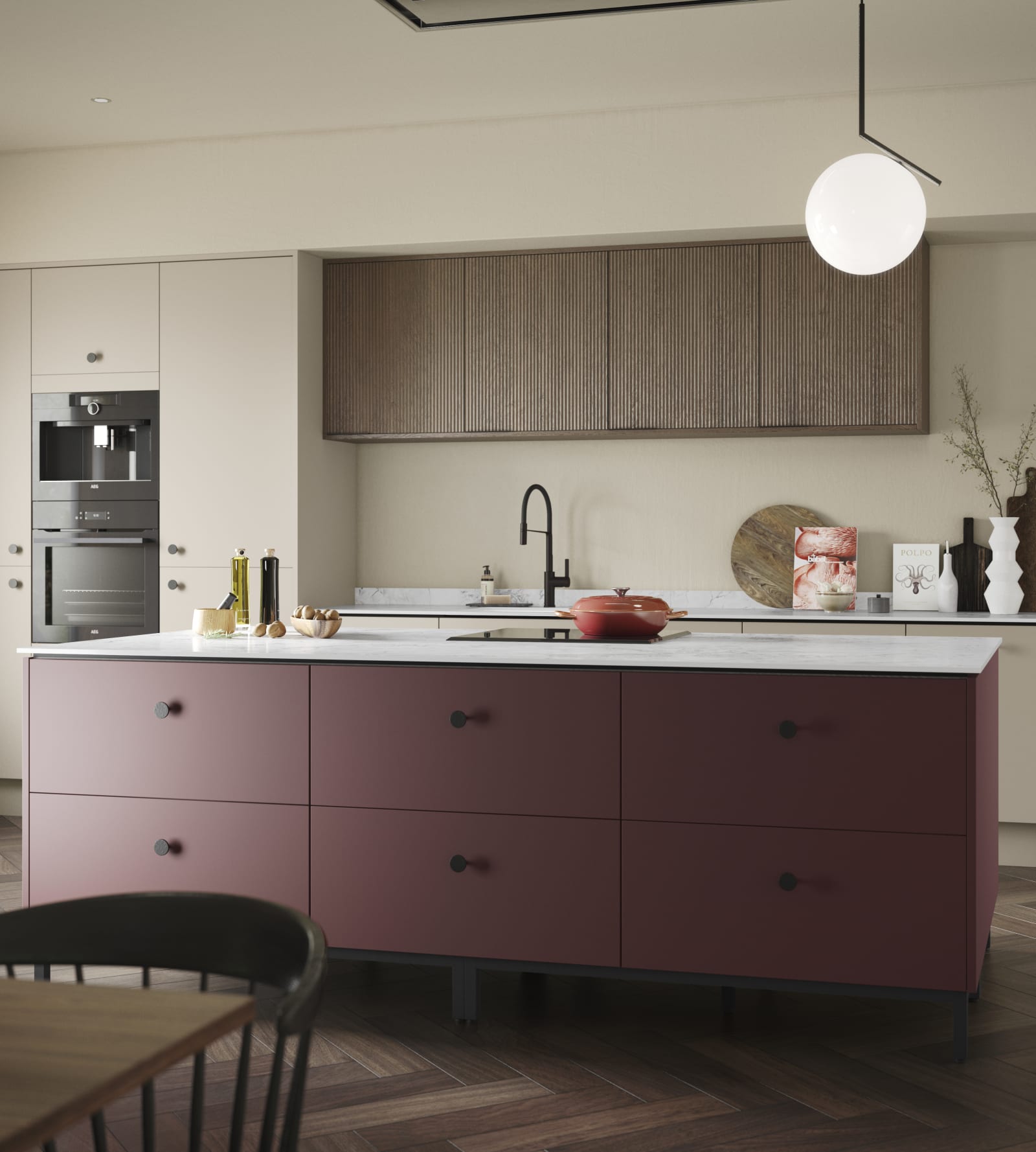
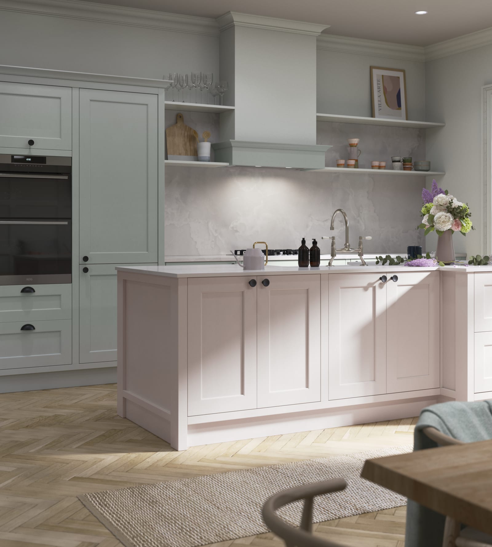
Blush, rose, or salmon pinks are also popular for kitchens because they are linked to calm and happier moods, which can be beneficial for the whole family. Our Rose Bowl cabinetry looks striking yet seamless in any setting - classic or modern - and will work with harmonious colours, tonal colours or contrasting colours.
A great complementary colour is green, with pink and green kitchens being one of the most interesting interior design stories of the century. If you want a gentle colour pop that is comfortable on the eye, pink and green could be the ideal choice for your colourful kitchen design project.
Get an expert design and itemised quote completely free of charge
Your dedicated designer will walk you through the design process
We’re happy to offer design consultations in-store and online
Let’s start creating your dream kitchen!